In a quest to revolutionize animation aesthetics and often tedious production processes in the early days of cinema, competing animation studios developed popular characters and new technologies to create smoother motion and synchronized sound. As Disney's near-total domination of the American market has allowed it to partially re-write history, credit for the first synchronized sound cartoon often goes to "Steamboat Willie," also erroneously labeled as the first to feature Mickey Mouse. However, it was Disney's stiffest competition, the Fleischer Studios, that pioneered the technology behind 'Car-Tunes,' in which the bouncing ball was debuted in theater sing-a-longs; and rotoscoping, in which a character is drawn over live action footage.
The first character to be rotoscoped--over footage of Max Fleischer's brother, Dave--was KoKo the Clown, who starred in the 'Car-Tunes' series and got his start in the popular "Out of the Inkwell" shorts in 1919. He was also seen in cartoons starring Betty Boop, one of the more popular characters to emerge from Fleischer Studios. In addition to KoKo, several of Boop's cartoons are notable for using rotoscope over film of American jazz artist, Cab Calloway. Calloway performed the songs, "Minnie the Moocher," "St. James Infirmary Blues," and "The Old Man Of the Mountain," specifically for the Boop shorts; "Moocher" became his most famous recording, seen below in Fleischer's version of "Snow White." The dance steps of the ghost are traced from Calloway's signature moves.
Apart from creating fluid animation, rotoscoping also acts as a kind of mask for live action film that allows individual components to be isolated from the remainder of the frame. This is perhaps its most common use today; my instructor counted at least 90 instances of rotoscoping during this year's Super Bowl broadcast. However, it remains incredibly time consuming. This ten second clip, of Gene Kelly in "Singing in the Rain," is comprised of 150 individual frames that took around 20 hours.
On the plus side, if you ever wanted to watch Gene Kelly dance on Jupiter, the Great Wall of China, or in the jungle, it is now entirely possible.
Thursday, March 4, 2010
Wednesday, March 3, 2010
New Year, New Antics
Hello again!
Presently, I am halfway through my second semester at NYU-CADA, and have probably set several new standards for inefficient blogging. (Poor time management skills.) However, I hope to make up for some of that lost time now by covering a few of the projects that have been keep me occupied lately.
My two classes this time around are 2D Tool Sets and 3D Tool Sets. Primarily, I am dealing with one program for each class: AfterEffects and Maya. As detailing Maya and 3D space requires lots of technical terms like "polynomial expressions," which continue to give me a headache, I am going to skip it for now.
In an ideal world, I would have taken 2D last semester when I was struggling to work with AfterEffects for "Picture Window." I have been working almost entirely in AE for this class, occasionally importing files from Photoshop. The work thus far has been mastering keyframes, which enable you to chose a point on a timeline and assign various values to the footage. There are five properties: anchor point, position, scale, rotation, and opacity. In addition, AE's many effects functions each contain variations on these properties, resulting in an infinite set of adjustments to the layers in a composition. In "Picture Window," each individual shape that falls into place to build the waves, ark, and sky, has at least two keyframes that tell the shape where to start and end. (Or in my case, end and start, as I worked backwards and played it forward.)
However, you may find this bobblehead-version of myself as Grace Kelly a more amusing example. My movements between scenes are position and scale keyframes, and the bobbing is done using a set of rotation keyframes that have been put on a loop using Javascript code. Sorry for the pixellation--I had to cut the video dimensions in half to upload it.
More to come on rotoscoping later this week!
~J
Tuesday, December 15, 2009
The Great Reveal
Well, needless to say, there was less and less time for me to post anything for you over the past few months; I think it officially ran out sometime around late October. In any event, I spent most of that time in the CADA computer lab trying to figure out why I couldn't do various tasks in AFX, FCP, etc.
However, the hours of stress have, I think, paid off--even if the finished product is only 30 seconds! It's my first ever animation.
I now give you "Picture Window": rendered entirely in Photoshop and AFX, edited in FCP and Soundtrack Pro.
However, the hours of stress have, I think, paid off--even if the finished product is only 30 seconds! It's my first ever animation.
I now give you "Picture Window": rendered entirely in Photoshop and AFX, edited in FCP and Soundtrack Pro.
Thursday, October 22, 2009
Animatics
No rest for the weary in this production.
Following up on my DPP storyboard for "Noah" is the animatic. While my example is an extremely primitive version, it still serves its purpose as the intermediary step between storyboards and the animation process. In professional productions, every storyboard shot is compiled using a non-linear editing system (i.e. Final Cut Pro, Avid), meaning that the film editor can rearrange shot lengths and sequences without destroying any content. The result is a kind of flipbook in which each shot is timed out in advance of any actual production; the director can see how long each composition will be seen on screen and how the sequence plays out from shot to shot.
The flipbook effect is lost in my example because I am only working with six storyboards; of course, I plan on having more than six shots. In any event, I successfully completed my first assignment on Final Cut Pro (FCP) with only a slight headache, so that counts for something!
Monday, October 19, 2009
The Art of Storyboarding
Having been bombarded with midterm assignments over the past week, I can't bring myself to expound any further on the "Psychology of the Creative Eye." Instead, I'm here to share some information on storyboards: a pre-production phase in which scenes in a film are laid out and pre-visualized shot-by-shot.
I mentioned before that I have encountered some difficulty in conceiving of my "Noah's Ark" project for DPP, owing to the amount of planning involved well in advance of any actual production (or, for that matter, any knowledge of what the hell I'm doing technically). Essentially, I have identified this as the main point of variance between writing stories and showing them; there is far less room to maneuver when executing a story on film than on the printed page, again because of budget concerns. Halfway through a prose narrative or essay, I can decide that I would rather end my story on a completely different note with relatively little consequence. That is near impossible to fathom in cinematic terms. However, the key to avoiding this in film is to start with a strong script, so it all goes back to great writing anyway.
After developing a script, however, there is still the question of how each scene will be shot in terms of cinematography, lighting, blocking, editing, etc. What will the frame actually look like? How will the scene progress? How many different shots will there be? In order to answer these questions ahead of production, thereby saving both time and money, the storyboard was born.
While there exists some debate over who first came up with the idea of storyboards, the practice ultimately came to fruition at Walt Disney Studios, where it came into full use at or around 1933. John Canemaker (incidentally, a world-renowned animator and scholar who teaches at NYU) indicates in his book, "The Art and Artists of Disney's Storyboards" (1999), that a storyboard department was not quite full-fledged when the "Father Noah's Ark" Silly Symphony cartoon was released in April of that year. In terms of format, storyboarding evolved from individual drawings shown along side the producer's script, to individual sheets of drawings that can be pinned on a wall and moved around as necessary to determine a scene's construction.
Disney perfected storyboards for the obvious reason that it made the animation process more manageable in a time when every single frame was drawn by hand; film is projected at 24 fps (frames per second). Ub Iwerks, one of Disney's earlist animators and the man who first drew Mickey Mouse, was known to sketch upwards of 700 drawings in a day. To have each shot laid out in advance meant that no extra work was required for scenes that later might be axed. There was enough work to be done as it was. Take, for example the first feature-length animated film, "Snow White and the Seven Dwarfs" (1937). It required 362,919 frames of color film, which required 1.5 million pen and ink drawings!
Below I have included a clip from what is perhaps my favorite Disney film, "Sleeping Beauty," along with the storyboards that coincide with it. The storyboards pick up around the 0:37 mark, but you will notice some changes where shots were displaced during production and post.

Given the economical benefits of storyboards, it was only matter of time before the practice went mainstream and became integral to live-action filmmaking as well, used by the likes of Orson Welles, Akira Kurosawa, Federico Fellini, David Lynch, and Sergei Eisenstein (the latter of whom, somewhat surprisingly, was a huge fan of the Disney studio). It is rumored that Alfred Hitchcock often didn't bother looking through his camera's view finder because he knew from his storyboards exactly what the frame looked like.
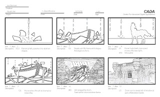
Lastly, here are my storyboards for the "Noah's Ark" project. We were limited to six and had to do them on Photoshop (I think I still prefer Disney's pen and ink methods...)
I mentioned before that I have encountered some difficulty in conceiving of my "Noah's Ark" project for DPP, owing to the amount of planning involved well in advance of any actual production (or, for that matter, any knowledge of what the hell I'm doing technically). Essentially, I have identified this as the main point of variance between writing stories and showing them; there is far less room to maneuver when executing a story on film than on the printed page, again because of budget concerns. Halfway through a prose narrative or essay, I can decide that I would rather end my story on a completely different note with relatively little consequence. That is near impossible to fathom in cinematic terms. However, the key to avoiding this in film is to start with a strong script, so it all goes back to great writing anyway.
After developing a script, however, there is still the question of how each scene will be shot in terms of cinematography, lighting, blocking, editing, etc. What will the frame actually look like? How will the scene progress? How many different shots will there be? In order to answer these questions ahead of production, thereby saving both time and money, the storyboard was born.
While there exists some debate over who first came up with the idea of storyboards, the practice ultimately came to fruition at Walt Disney Studios, where it came into full use at or around 1933. John Canemaker (incidentally, a world-renowned animator and scholar who teaches at NYU) indicates in his book, "The Art and Artists of Disney's Storyboards" (1999), that a storyboard department was not quite full-fledged when the "Father Noah's Ark" Silly Symphony cartoon was released in April of that year. In terms of format, storyboarding evolved from individual drawings shown along side the producer's script, to individual sheets of drawings that can be pinned on a wall and moved around as necessary to determine a scene's construction.
Disney perfected storyboards for the obvious reason that it made the animation process more manageable in a time when every single frame was drawn by hand; film is projected at 24 fps (frames per second). Ub Iwerks, one of Disney's earlist animators and the man who first drew Mickey Mouse, was known to sketch upwards of 700 drawings in a day. To have each shot laid out in advance meant that no extra work was required for scenes that later might be axed. There was enough work to be done as it was. Take, for example the first feature-length animated film, "Snow White and the Seven Dwarfs" (1937). It required 362,919 frames of color film, which required 1.5 million pen and ink drawings!
Below I have included a clip from what is perhaps my favorite Disney film, "Sleeping Beauty," along with the storyboards that coincide with it. The storyboards pick up around the 0:37 mark, but you will notice some changes where shots were displaced during production and post.

Given the economical benefits of storyboards, it was only matter of time before the practice went mainstream and became integral to live-action filmmaking as well, used by the likes of Orson Welles, Akira Kurosawa, Federico Fellini, David Lynch, and Sergei Eisenstein (the latter of whom, somewhat surprisingly, was a huge fan of the Disney studio). It is rumored that Alfred Hitchcock often didn't bother looking through his camera's view finder because he knew from his storyboards exactly what the frame looked like.
Lastly, here are my storyboards for the "Noah's Ark" project. We were limited to six and had to do them on Photoshop (I think I still prefer Disney's pen and ink methods...)

Monday, October 12, 2009
Pre-Production
Following up on my post of a few weeks ago, the HD-DVD project in DPP continues to progress through the development and pre-production stages. This means that I have completed a project treatment and a script for the Noah's Ark concept. Supposing that this project was an actual industry commission or freelance piece, it would mean that I have successfully pitched the idea and likely been paid a percentage of the overall production cost in order to proceed. The script is a producer's script, which uses a three-column format to break down the action into audio, visual, and time components (i.e. what you see and hear on screen at a specific time). This is only challenging in the sense that it requires me to plan out more than I am used to; creatively, I prefer to start with an elemental concept and let it take me who-knows-where. Filmmaking, however, requires a stricter sense of where I end up because of the hypothetical cost accrual--either to myself or a client.
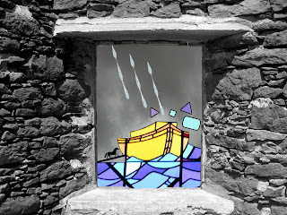
The next step, and the subject of this week's assignment, is to create a visual that showcases the project's look, feel, and even theme. Ideally, the style frame should closely resemble a shot that will occur in the finished piece. Once again, I have put my Photoshopping (the only shopping I do these days) skills to the test and come up with this. It goes without saying that I chose the stained glass aesthetic for the short.
Coming soon: A trip to the MoMA and more on the psychology of visual perception! (Exciting, I know...)
The next step, and the subject of this week's assignment, is to create a visual that showcases the project's look, feel, and even theme. Ideally, the style frame should closely resemble a shot that will occur in the finished piece. Once again, I have put my Photoshopping (the only shopping I do these days) skills to the test and come up with this. It goes without saying that I chose the stained glass aesthetic for the short.

Coming soon: A trip to the MoMA and more on the psychology of visual perception! (Exciting, I know...)
Friday, October 2, 2009
Art, Mathematics, and Psychology
Thus far, I have written mostly about ongoing project developments and information pertaining to my DPP class. Meanwhile, most of my time has been spent reading, studying, and designing for Art, Technology, and Design (ATD). Essentially a crash course in graphic design, ATD is a bit like taking a linguistics class where, instead of letter-based semantics, one studies how to "read" pictures. Surprisingly, this involves a fair bit of background in psychology and mathematical principles.
The primary text is Rudolph Arnheim's "Art and Visual Perception: A Psychology of the Creative Eye," and yes, is about as dense as it sounds. Arnheim describes the various ways in which the mind processes certain qualities of an image. For instance, the relatively simple rule that Westerners "read" images from left to right--like text--is explained by delving into the functions of the left and right cerebral cortex and their related functions. He also says that we perceive objects to be stable or restless depending on a shape's imaginary structural skeleton. The restful loci in a square, for example, can be found along the diagonal, horizontal, and vertical axes passing through its imaginary center. These rules are essential to achieving balance in a composition, regardless of whether or not the observer is aware of them; we sense innately that something is imbalanced even if we cannot explain why that is so.
Similarly, certain laws of psychology--specifically those of the Gestalt school--enable us to arrive at conclusions based on how objects exist in relation to one another (part to whole). Gestalt, from the German meaning "whole" or "form," describes the concepts that make unity and variety possible in design. Each principle can be used both to group or to un-group (A or Not-A, as Derrida might put it). Ultimately, Gestalt theorists believe that the whole, in perception, is more than the sum of its parts. Their basic organizing laws, which are more or less self-explanatory are: Proximity, Similarity, Closure, Continuity, and Symmetry. Therefore, objects closer together appear grouped; objects that are similar in shape, color, or size appear grouped; etc. Within each law there exists one or more subsets, creating a hierarchy that artists then use to convey meaning. Or not. I personally feel that some of this is a bit too technical a way to explain great art, depending on the medium.
One thing that does seem inescapable, though, is the ratio 1.618 : 1. This is the mathematical principle underlying the Golden Mean, from which the golden rectangle also derives. A golden rectangle is one that can be partitioned into a square and a smaller rectangle, which has the same length to height aspect ratio as the original rectangle of 1.618 : 1. This means that the smaller rectangle can also be divided into a square and a golden rectangle, and so on. Pythagoras is credited with constructing the first golden rectangle in the 6th century B.C., although it appears to have been used by the Egyptians in the construction of the Great Pyramids. This again raises the question: To what extent are these design choices made subconsciously? Leonard Da Vinci, however, saw the golden mean as evidence of a spiritual force rather than a psychological one. In his studies of the human body, he found that the distance from the soles of a man's feet to his navel, divided by the distance between the navel and the top of his head, was 1.618: the Divine Proportion.
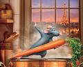
The recurrence of this number in nature is indeed prolific and naturally raises questions about a supreme order--or even a supreme being. In terms of art, it essentially asks us to consider whether there can exist a mathematical formula for determining beauty? Such was indeed the case for the Parthenon. Rather than continuing to explore it here in laborious prose, however, I return now to this project's roots in animation and present the short film that we watched in ATD. Not surprisingly, I particularly enjoy the bunny rabbits.
">
The primary text is Rudolph Arnheim's "Art and Visual Perception: A Psychology of the Creative Eye," and yes, is about as dense as it sounds. Arnheim describes the various ways in which the mind processes certain qualities of an image. For instance, the relatively simple rule that Westerners "read" images from left to right--like text--is explained by delving into the functions of the left and right cerebral cortex and their related functions. He also says that we perceive objects to be stable or restless depending on a shape's imaginary structural skeleton. The restful loci in a square, for example, can be found along the diagonal, horizontal, and vertical axes passing through its imaginary center. These rules are essential to achieving balance in a composition, regardless of whether or not the observer is aware of them; we sense innately that something is imbalanced even if we cannot explain why that is so.
Similarly, certain laws of psychology--specifically those of the Gestalt school--enable us to arrive at conclusions based on how objects exist in relation to one another (part to whole). Gestalt, from the German meaning "whole" or "form," describes the concepts that make unity and variety possible in design. Each principle can be used both to group or to un-group (A or Not-A, as Derrida might put it). Ultimately, Gestalt theorists believe that the whole, in perception, is more than the sum of its parts. Their basic organizing laws, which are more or less self-explanatory are: Proximity, Similarity, Closure, Continuity, and Symmetry. Therefore, objects closer together appear grouped; objects that are similar in shape, color, or size appear grouped; etc. Within each law there exists one or more subsets, creating a hierarchy that artists then use to convey meaning. Or not. I personally feel that some of this is a bit too technical a way to explain great art, depending on the medium.
One thing that does seem inescapable, though, is the ratio 1.618 : 1. This is the mathematical principle underlying the Golden Mean, from which the golden rectangle also derives. A golden rectangle is one that can be partitioned into a square and a smaller rectangle, which has the same length to height aspect ratio as the original rectangle of 1.618 : 1. This means that the smaller rectangle can also be divided into a square and a golden rectangle, and so on. Pythagoras is credited with constructing the first golden rectangle in the 6th century B.C., although it appears to have been used by the Egyptians in the construction of the Great Pyramids. This again raises the question: To what extent are these design choices made subconsciously? Leonard Da Vinci, however, saw the golden mean as evidence of a spiritual force rather than a psychological one. In his studies of the human body, he found that the distance from the soles of a man's feet to his navel, divided by the distance between the navel and the top of his head, was 1.618: the Divine Proportion.
The recurrence of this number in nature is indeed prolific and naturally raises questions about a supreme order--or even a supreme being. In terms of art, it essentially asks us to consider whether there can exist a mathematical formula for determining beauty? Such was indeed the case for the Parthenon. Rather than continuing to explore it here in laborious prose, however, I return now to this project's roots in animation and present the short film that we watched in ATD. Not surprisingly, I particularly enjoy the bunny rabbits.
">
Subscribe to:
Posts (Atom)