No rest for the weary in this production.
Following up on my DPP storyboard for "Noah" is the animatic. While my example is an extremely primitive version, it still serves its purpose as the intermediary step between storyboards and the animation process. In professional productions, every storyboard shot is compiled using a non-linear editing system (i.e. Final Cut Pro, Avid), meaning that the film editor can rearrange shot lengths and sequences without destroying any content. The result is a kind of flipbook in which each shot is timed out in advance of any actual production; the director can see how long each composition will be seen on screen and how the sequence plays out from shot to shot.
The flipbook effect is lost in my example because I am only working with six storyboards; of course, I plan on having more than six shots. In any event, I successfully completed my first assignment on Final Cut Pro (FCP) with only a slight headache, so that counts for something!
Thursday, October 22, 2009
Monday, October 19, 2009
The Art of Storyboarding
Having been bombarded with midterm assignments over the past week, I can't bring myself to expound any further on the "Psychology of the Creative Eye." Instead, I'm here to share some information on storyboards: a pre-production phase in which scenes in a film are laid out and pre-visualized shot-by-shot.
I mentioned before that I have encountered some difficulty in conceiving of my "Noah's Ark" project for DPP, owing to the amount of planning involved well in advance of any actual production (or, for that matter, any knowledge of what the hell I'm doing technically). Essentially, I have identified this as the main point of variance between writing stories and showing them; there is far less room to maneuver when executing a story on film than on the printed page, again because of budget concerns. Halfway through a prose narrative or essay, I can decide that I would rather end my story on a completely different note with relatively little consequence. That is near impossible to fathom in cinematic terms. However, the key to avoiding this in film is to start with a strong script, so it all goes back to great writing anyway.
After developing a script, however, there is still the question of how each scene will be shot in terms of cinematography, lighting, blocking, editing, etc. What will the frame actually look like? How will the scene progress? How many different shots will there be? In order to answer these questions ahead of production, thereby saving both time and money, the storyboard was born.
While there exists some debate over who first came up with the idea of storyboards, the practice ultimately came to fruition at Walt Disney Studios, where it came into full use at or around 1933. John Canemaker (incidentally, a world-renowned animator and scholar who teaches at NYU) indicates in his book, "The Art and Artists of Disney's Storyboards" (1999), that a storyboard department was not quite full-fledged when the "Father Noah's Ark" Silly Symphony cartoon was released in April of that year. In terms of format, storyboarding evolved from individual drawings shown along side the producer's script, to individual sheets of drawings that can be pinned on a wall and moved around as necessary to determine a scene's construction.
Disney perfected storyboards for the obvious reason that it made the animation process more manageable in a time when every single frame was drawn by hand; film is projected at 24 fps (frames per second). Ub Iwerks, one of Disney's earlist animators and the man who first drew Mickey Mouse, was known to sketch upwards of 700 drawings in a day. To have each shot laid out in advance meant that no extra work was required for scenes that later might be axed. There was enough work to be done as it was. Take, for example the first feature-length animated film, "Snow White and the Seven Dwarfs" (1937). It required 362,919 frames of color film, which required 1.5 million pen and ink drawings!
Below I have included a clip from what is perhaps my favorite Disney film, "Sleeping Beauty," along with the storyboards that coincide with it. The storyboards pick up around the 0:37 mark, but you will notice some changes where shots were displaced during production and post.

Given the economical benefits of storyboards, it was only matter of time before the practice went mainstream and became integral to live-action filmmaking as well, used by the likes of Orson Welles, Akira Kurosawa, Federico Fellini, David Lynch, and Sergei Eisenstein (the latter of whom, somewhat surprisingly, was a huge fan of the Disney studio). It is rumored that Alfred Hitchcock often didn't bother looking through his camera's view finder because he knew from his storyboards exactly what the frame looked like.
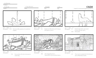
Lastly, here are my storyboards for the "Noah's Ark" project. We were limited to six and had to do them on Photoshop (I think I still prefer Disney's pen and ink methods...)

I mentioned before that I have encountered some difficulty in conceiving of my "Noah's Ark" project for DPP, owing to the amount of planning involved well in advance of any actual production (or, for that matter, any knowledge of what the hell I'm doing technically). Essentially, I have identified this as the main point of variance between writing stories and showing them; there is far less room to maneuver when executing a story on film than on the printed page, again because of budget concerns. Halfway through a prose narrative or essay, I can decide that I would rather end my story on a completely different note with relatively little consequence. That is near impossible to fathom in cinematic terms. However, the key to avoiding this in film is to start with a strong script, so it all goes back to great writing anyway.
After developing a script, however, there is still the question of how each scene will be shot in terms of cinematography, lighting, blocking, editing, etc. What will the frame actually look like? How will the scene progress? How many different shots will there be? In order to answer these questions ahead of production, thereby saving both time and money, the storyboard was born.
While there exists some debate over who first came up with the idea of storyboards, the practice ultimately came to fruition at Walt Disney Studios, where it came into full use at or around 1933. John Canemaker (incidentally, a world-renowned animator and scholar who teaches at NYU) indicates in his book, "The Art and Artists of Disney's Storyboards" (1999), that a storyboard department was not quite full-fledged when the "Father Noah's Ark" Silly Symphony cartoon was released in April of that year. In terms of format, storyboarding evolved from individual drawings shown along side the producer's script, to individual sheets of drawings that can be pinned on a wall and moved around as necessary to determine a scene's construction.
Disney perfected storyboards for the obvious reason that it made the animation process more manageable in a time when every single frame was drawn by hand; film is projected at 24 fps (frames per second). Ub Iwerks, one of Disney's earlist animators and the man who first drew Mickey Mouse, was known to sketch upwards of 700 drawings in a day. To have each shot laid out in advance meant that no extra work was required for scenes that later might be axed. There was enough work to be done as it was. Take, for example the first feature-length animated film, "Snow White and the Seven Dwarfs" (1937). It required 362,919 frames of color film, which required 1.5 million pen and ink drawings!
Below I have included a clip from what is perhaps my favorite Disney film, "Sleeping Beauty," along with the storyboards that coincide with it. The storyboards pick up around the 0:37 mark, but you will notice some changes where shots were displaced during production and post.

Given the economical benefits of storyboards, it was only matter of time before the practice went mainstream and became integral to live-action filmmaking as well, used by the likes of Orson Welles, Akira Kurosawa, Federico Fellini, David Lynch, and Sergei Eisenstein (the latter of whom, somewhat surprisingly, was a huge fan of the Disney studio). It is rumored that Alfred Hitchcock often didn't bother looking through his camera's view finder because he knew from his storyboards exactly what the frame looked like.
Lastly, here are my storyboards for the "Noah's Ark" project. We were limited to six and had to do them on Photoshop (I think I still prefer Disney's pen and ink methods...)

Monday, October 12, 2009
Pre-Production
Following up on my post of a few weeks ago, the HD-DVD project in DPP continues to progress through the development and pre-production stages. This means that I have completed a project treatment and a script for the Noah's Ark concept. Supposing that this project was an actual industry commission or freelance piece, it would mean that I have successfully pitched the idea and likely been paid a percentage of the overall production cost in order to proceed. The script is a producer's script, which uses a three-column format to break down the action into audio, visual, and time components (i.e. what you see and hear on screen at a specific time). This is only challenging in the sense that it requires me to plan out more than I am used to; creatively, I prefer to start with an elemental concept and let it take me who-knows-where. Filmmaking, however, requires a stricter sense of where I end up because of the hypothetical cost accrual--either to myself or a client.
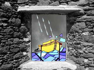
The next step, and the subject of this week's assignment, is to create a visual that showcases the project's look, feel, and even theme. Ideally, the style frame should closely resemble a shot that will occur in the finished piece. Once again, I have put my Photoshopping (the only shopping I do these days) skills to the test and come up with this. It goes without saying that I chose the stained glass aesthetic for the short.

Coming soon: A trip to the MoMA and more on the psychology of visual perception! (Exciting, I know...)
The next step, and the subject of this week's assignment, is to create a visual that showcases the project's look, feel, and even theme. Ideally, the style frame should closely resemble a shot that will occur in the finished piece. Once again, I have put my Photoshopping (the only shopping I do these days) skills to the test and come up with this. It goes without saying that I chose the stained glass aesthetic for the short.

Coming soon: A trip to the MoMA and more on the psychology of visual perception! (Exciting, I know...)
Friday, October 2, 2009
Art, Mathematics, and Psychology
Thus far, I have written mostly about ongoing project developments and information pertaining to my DPP class. Meanwhile, most of my time has been spent reading, studying, and designing for Art, Technology, and Design (ATD). Essentially a crash course in graphic design, ATD is a bit like taking a linguistics class where, instead of letter-based semantics, one studies how to "read" pictures. Surprisingly, this involves a fair bit of background in psychology and mathematical principles.
The primary text is Rudolph Arnheim's "Art and Visual Perception: A Psychology of the Creative Eye," and yes, is about as dense as it sounds. Arnheim describes the various ways in which the mind processes certain qualities of an image. For instance, the relatively simple rule that Westerners "read" images from left to right--like text--is explained by delving into the functions of the left and right cerebral cortex and their related functions. He also says that we perceive objects to be stable or restless depending on a shape's imaginary structural skeleton. The restful loci in a square, for example, can be found along the diagonal, horizontal, and vertical axes passing through its imaginary center. These rules are essential to achieving balance in a composition, regardless of whether or not the observer is aware of them; we sense innately that something is imbalanced even if we cannot explain why that is so.
Similarly, certain laws of psychology--specifically those of the Gestalt school--enable us to arrive at conclusions based on how objects exist in relation to one another (part to whole). Gestalt, from the German meaning "whole" or "form," describes the concepts that make unity and variety possible in design. Each principle can be used both to group or to un-group (A or Not-A, as Derrida might put it). Ultimately, Gestalt theorists believe that the whole, in perception, is more than the sum of its parts. Their basic organizing laws, which are more or less self-explanatory are: Proximity, Similarity, Closure, Continuity, and Symmetry. Therefore, objects closer together appear grouped; objects that are similar in shape, color, or size appear grouped; etc. Within each law there exists one or more subsets, creating a hierarchy that artists then use to convey meaning. Or not. I personally feel that some of this is a bit too technical a way to explain great art, depending on the medium.
One thing that does seem inescapable, though, is the ratio 1.618 : 1. This is the mathematical principle underlying the Golden Mean, from which the golden rectangle also derives. A golden rectangle is one that can be partitioned into a square and a smaller rectangle, which has the same length to height aspect ratio as the original rectangle of 1.618 : 1. This means that the smaller rectangle can also be divided into a square and a golden rectangle, and so on. Pythagoras is credited with constructing the first golden rectangle in the 6th century B.C., although it appears to have been used by the Egyptians in the construction of the Great Pyramids. This again raises the question: To what extent are these design choices made subconsciously? Leonard Da Vinci, however, saw the golden mean as evidence of a spiritual force rather than a psychological one. In his studies of the human body, he found that the distance from the soles of a man's feet to his navel, divided by the distance between the navel and the top of his head, was 1.618: the Divine Proportion.
The recurrence of this number in nature is indeed prolific and naturally raises questions about a supreme order--or even a supreme being. In terms of art, it essentially asks us to consider whether there can exist a mathematical formula for determining beauty? Such was indeed the case for the Parthenon. Rather than continuing to explore it here in laborious prose, however, I return now to this project's roots in animation and present the short film that we watched in ATD. Not surprisingly, I particularly enjoy the bunny rabbits.
">
Subscribe to:
Comments (Atom)
